Swift로 구현하는 팝오버(Popover) 날짜 선택기
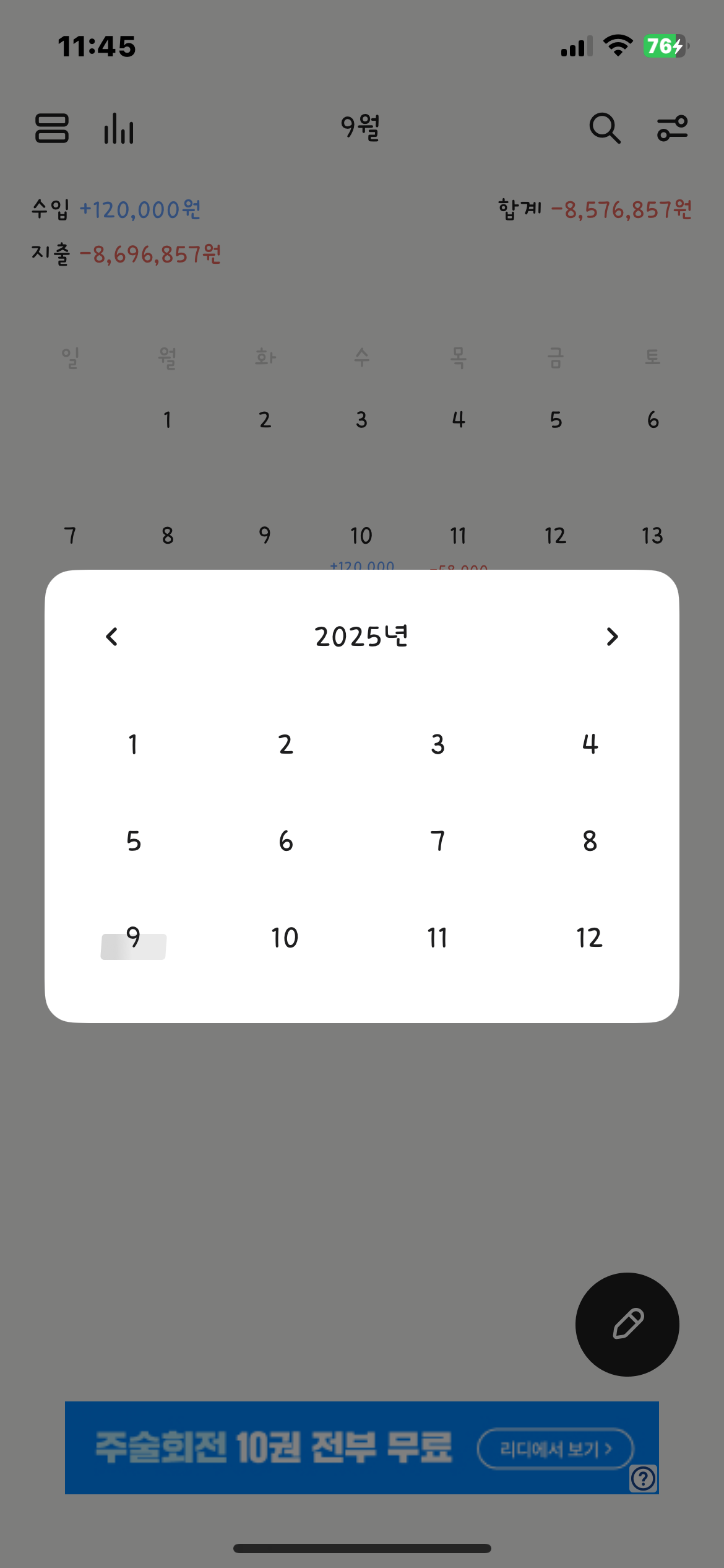
이번 글에서는 가계부 앱의 핵심 기능 중 하나인 '월별 날짜 선택' 기능을 개선한 방법에 대해 공유하려 합니다. 기존에는 스크롤을 통해 월을 이동하는 방식이었지만, 사용자 경험을 개선하고자 팝오버(Popover) 형태로 연도와 월을 한눈에 보고 선택할 수 있는 기능을 추가했습니다.
이 기능을 구현하는 데 사용된 핵심 기술은 UIPopoverPresentationController입니다. 일반적인 modal 방식과 달리, 팝오버는 기존 화면을 유지한 채 특정 뷰 위에 작은 뷰를 띄워 내용을 보여줄 수 있어, 가볍고 직관적인 UI를 제공합니다.
1. 팝오버 뷰 컨트롤러: DatePickerViewController
먼저, 날짜를 선택하는 팝오버 화면을 담당할 DatePickerViewController를 살펴보겠습니다. 이 뷰 컨트롤러는 연도를 표시하는 UILabel과 UIImageView로 구성된 상단 뷰, 그리고 12개의 월을 표시하는 UICollectionView로 이루어져 있습니다.
class DatePickerViewController: UIViewController {

    // MARK: - Properties & Closure

    private var currentYear: Int = 0
    private var currentMonth: Int = 0

    var selectedDate: ((Int, Int) -> Void)?

    // MARK: - UI Elements

    private let yearLabel: UILabel = {
        let label = UILabel()
        label.font = UIFont(name: "Ownglyph_daelong-Rg", size: 20) ?? .systemFont(ofSize: 20, weight: .regular)
        label.textColor = .label
        label.textAlignment = .center
        return label
    }()

    private let previousImage: UIImageView = {
        let imageView = UIImageView(image: UIImage(systemName: "arrow.backward"))
        imageView.tintColor = .label
        imageView.isUserInteractionEnabled = true
        return imageView
    }()

    private let followingImage: UIImageView = {
        let imageView = UIImageView(image: UIImage(systemName: "arrow.forward"))
        imageView.tintColor = .label
        imageView.isUserInteractionEnabled = true
        return imageView
    }()

    private var dateCollectionView: UICollectionView!

    // MARK: - Life Cycle

    override func viewDidLoad() {
        super.viewDidLoad()
        self.currentYear = Calendar.current.component(.year, from: Date())
        configureUI()
        setupAction()
    }
}
- UI 구성: UIStackView를 활용하여 연도와 화살표 이미지를 깔끔하게 배치했습니다. UICollectionView는 12개의 월을 표시하는 역할을 합니다.
- 클로저(selectedDate): 이 클로저는 날짜 선택 시 호출되는 콜백 함수입니다. 선택된 연도와 월을 상위 뷰 컨트롤러(캘린더 뷰)로 전달하는 중요한 역할을 합니다.
컬렉션 뷰 설정
UICollectionView는 UICollectionViewDelegateFlowLayout과 UICollectionViewDataSource 프로토콜을 채택하여 월별 셀을 구성합니다. 4열로 나누어 widthPerItem을 계산하는 로직이 인상적입니다.
didSelectItemAt: 셀 선택 시, selectedDate 클로저를 통해 선택된 연도와 월을 전달하고, dismiss를 호출하여 팝오버를 닫습니다.
// UICollectionViewDelegateFlowLayout
func collectionView(_ collectionView: UICollectionView, layout collectionViewLayout: UICollectionViewLayout, sizeForItemAt indexPath: IndexPath) -> CGSize {
    let interItemSpacing: CGFloat = 8
    let totalSpacing = interItemSpacing * 3 // 3개의 간격
    let availableWidth = collectionView.bounds.width - totalSpacing
    let widthPerItem = availableWidth / 4

    return CGSize(width: widthPerItem, height: widthPerItem - 8)
}

// UICollectionViewDataSource
func collectionView(_ collectionView: UICollectionView, numberOfItemsInSection section: Int) -> Int {
    return 12
}

func collectionView(_ collectionView: UICollectionView, cellForItemAt indexPath: IndexPath) -> UICollectionViewCell {
    let cell = collectionView.dequeueReusableCell(withReuseIdentifier: "monthCell", for: indexPath)
    let monthLabel = UILabel(frame: cell.contentView.bounds)
    monthLabel.text = "\(indexPath.item + 1)"
    // ... UI 설정
    cell.contentView.addSubview(monthLabel)
    return cell
}

func collectionView(_ collectionView: UICollectionView, didSelectItemAt indexPath: IndexPath) {
    let selectedMonth = indexPath.item + 1
    self.currentMonth = selectedMonth
    selectedDate?(currentYear, currentMonth) // 클로저 호출
    dismiss(animated: true)
}
2. 팝오버 표시하기: PopoverPresentationController
이제 DatePickerViewController를 캘린더 뷰에서 팝오버 형태로 띄워봅시다. UITapGestureRecognizer를 통해 월을 표시하는 UILabel이 탭되었을 때, didTappedMonthLabel() 메서드가 호출됩니다.
didTappedMonthLabel() 메서드
@objc private func didTappedMonthLabel() {
    let datePickerVC = DatePickerViewController()

    // 팝오버 스타일 설정
    datePickerVC.modalPresentationStyle = .popover
    datePickerVC.preferredContentSize = CGSize(width: 250, height: 200)

    // 날짜 선택 클로저 구현
    datePickerVC.selectedDate = { [weak self] year, month in
        guard let self = self else { return }
        let dateComponents = DateComponents(year: year, month: month)
        guard let selectedDate = Calendar.current.date(from: dateComponents) else { return }

        self.calendarViewModel.currentMonth = selectedDate
        self.calendarViewModel.setupInitialData(with: selectedDate)
        self.monthLabel.text = self.formattedMonth(for: self.calendarViewModel.currentMonth)
    }

    // UIPopoverPresentationController 설정
    if let popover = datePickerVC.popoverPresentationController {
        popover.sourceView = monthLabel // 팝오버가 시작될 뷰 (monthLabel)
        popover.permittedArrowDirections = [.up, .down] // 화살표 방향
        popover.delegate = self // 델리게이트 지정
    }

    present(datePickerVC, animated: true)
}
- modalPresentationStyle = .popover:
- 뷰 컨트롤러를 팝오버 스타일로 띄우겠다고 선언하는 가장 중요한 코드입니다.
- preferredContentSize:
- 팝오버 뷰의 크기를 설정합니다.
- popover.sourceView:
- 팝오버가 어디에서 나올지 기준이 되는 뷰를 지정합니다. 여기서는 monthLabel이 팝오버를 띄우는 기준이 됩니다.
- popover.permittedArrowDirections:
- 팝오버가 가리키는 화살표의 방향을 설정합니다.
- popover.delegate:
- 팝오버의 동작을 제어하기 위해 델리게이트를 지정합니다. UIPopoverPresentationControllerDelegate를 채택하면 아이폰에서 팝오버가 전체 화면으로 표시되는 것을 막을 수 있습니다.
3. 마무리: 델리게이트 메서드 구현
아이폰에서는 팝오버가 기본적으로 전체 화면으로 표시됩니다. 이를 방지하고 팝오버 스타일을 유지하려면 UIPopoverPresentationControllerDelegate를 채택하고 다음 델리게이트 메서드를 구현해야 합니다.
extension YourViewController: UIPopoverPresentationControllerDelegate {
    func adaptivePresentationStyle(for controller: UIPresentationController) -> UIModalPresentationStyle {
        return .none
    }
}
return .none을 통해 '어떤 환경에서든' 팝오버를 전체 화면으로 변환하지 않도록 설정하여 아이폰에서도 팝오버 스타일을 유지할 수 있습니다.
이번 개선을 통해 가계부 앱 사용자는 월을 직관적으로 선택하고, 더 편리하게 데이터를 관리할 수 있게 되었습니다. 팝오버 기능은 날짜 선택 외에도 다양한 상황에서 깔끔한 UI를 구현하는 데 유용하게 활용될 수 있습니다.

'한눈가계부 > 캘린더' 카테고리의 다른 글
| 커스텀 캘린더 만들기: 전체 설계부터 구현까지 🗓️ (3) | 2025.08.29 |
|---|
